So yesterday my friend and I watched Loving Vincent (an incredible movie, by the way, and the reason I’m on this van Gogh obsession lately). After it ended, we turned to each other like
a) hi im crying at how beautiful that was, how about you? yup? same
and b)
we should make a van Gogh painting right now
So we impulsively grabbed all the paint in the house, rolled out a big sheet of paper, and just dove in. This was our reference:
She mixed colors for the sky, and I made a palette for the grass.
At first, we tried to match van Gogh’s style as closely as possible. This corner was decidedly a success.
She was a bit nervous to undertake the bold swirly tree in the middle, but I’d say it turned out great 👌👌
At some point, though, we realized other influences might have been creeping in. These flowers? Solidly Monet.
These? I don’t even know what style they are but they are my children and I love them
In total, this took us about 4 hours, give or take. We had to stop when it turned midnight, bc…… sleep.
It didn’t end up looking exactly like van Gogh’s original (or even very much like it, for that matter), but as he himself said, “what is done in love is well done,” and we certainly made this with love and enjoyed the process immensely.
And, if I may say so myself, it’s not bad for a first time.
Colin Firth is really out here living his best life in 2018, swinging around on a boat to Dancing Queen and Titanic posing with Stellan Skarsgard on the prow and still ending up drenched in a body of water while wearing a white shirt because he respects his own legacy.
My favorite quote from him is something like “I’m well aware that if I changed careers today, became an astronaut, and was the first human to go to another planet, the headline would read ‘Mr. Darcy Goes to Mars.’”
Let men be proud of being men. Let them be masculine ffs. They’re not born evil demons. They’re not inherently bad. Don’t give me the “men will never suffer for being men” bullshit cuz I have no time for any of that. Y’all just choose to ignore the struggles men go through.
As long as they’re aware of their privilege over other genders (which happens in most societies) and work to change the status quo so power is equally distributed even if it means giving up some of the privileges (i.e. being paid more, cheaper toiletries, not being expected to do all the housekeeping, among many others), then sure.
Men gotta realize that both their privileges and struggles come from the same source. Once they do and start fighting it, then yea, the generalization “men are awful” will be revised.
Update: It is not, in fact, the Richards, who don’t actually have the surname Richard, that’s just the name of the eldest boy that I hear screamed over the fence all the time. Richard is probably nine, maybe 10 and his younger borthers are twins of seven becuase I happened to run into them on thier birthday. They pointedly refused to tell me thier names, instead giggling ominously after I introduced myself and running away. This is the gang of boys that I’ve had to stop from torturing small animals on more than one occasion, and whose mother is the one that gets crying-drunk on the front porch late at night.
Lovely family.
Around this time last year thier grandmother came to visit and gave them honest-to-goodness home-made black-powder Cherry bombs direct from Texas, which the boys immediately took to the most flammable patch of chaparral in the neighborhood and set off six of them at once, resulting in a small wildfire, seven emergency response units and a helicopter, a Long Stern talk from the fire department and Karen getting in a screaming match with Child Protective Services and a sizeable crater in the middle of the field.
At least according to Olivia the ER nurse and neighborhood gossip. I was out of town at the time and believe about 80% of that becuase I saw the crater where there had not been a crater a week before, and becuase karen threw a shoe at me the one time I asked if she was alright when she was having her weekly drunk-cry on the porch.
But I Digress.
The Airhorn in fact belongs to one of the ladies at the Old Folks Home. Diane is very excited about the upcoming NBA playoffs and was having a bit of a pre-celebration in the park with her family and hadn’t realized the noise would carry. She’s rooting for Golden State becuase that’s where her grandson goes.
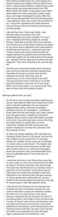
if fallout 76 really is a world where “every character is a real person” & there’s no NPCs im making it my civic duty to be like this lowly tavern barkeep and then once i’ve established enough of a rapport i’m going to nuke all of west virginia and it will be in character
someone help where’s the screenshot of some post somewhere about the mmo player who barkept for a longass time then fucked absolutely everyone over
I’ve started using flashcards more often (and I’m seeing a lot more of them on studyblrs and studygrams), so I decided to look up tips on how to use them. Here are some important ones I’ve found that I wanted to share with you guys! Hope this helps 🙂
A lot of you have been asking how I go about making my graphics, i.e. how I do graphic design, so I thought I’d make a guide – or perhaps a series of guides if you would like – on how to design graphics! First off, I’d like to introduce you to the fundamental elements of graphic design, and hopefully this will help you gain a new perspective. and improve your own design skills.
Lines are structures that connect two points. They make up everything that we see, even the letters and characters we read every day. But more often than not, we take them for granted. In reality, lines are one of the most rudimentary components of graphic design, and they serve to channel ideas and emotion.
Lines can:
Organize pieces of information or elements on a page
Serve as guidelines to lead the viewer’s eye
Provide movement such as using wavy lines to represent moving water
Emphasize certain parts of the page
Set a mood, such as how straight lines evoke order and neatness while zig-zags convey excitement and tension
A shape is any two-dimensional area with a recognizable boundary. They can add interest to designs (such as in backgrounds), organize visual content, and be used to make illustrations.
Shapes exist in three categories:
Geometric shapes are regular shapes like circles and squares
Organic shapes are more freeform, such as a blob or a leaf
Abstract shapes have a recognizable form but are not exactly natural shapes, such as alphabet glyphs, spirals, and stick figures
When brought together, these shapes can form helpful illustrations that will help convey meaning to your work or add some decoration to it.
The effects achieved by the shapes are determined by its form, color, size, and other characteristics. For example, triangles often show excitement and risk, while circles are seen as eternal and often feminine.
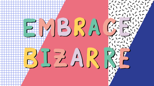
In the example illustration below, which is one of my January wallpapers, I use triangles to convey a feeling of vivacity and excitement.
Different shapes may also be used to structure content or create a layout, making it easier for the user’s eyes to find information. This is often the case in blogs and websites.
Color can be used to make an image stand out, convey information, enhance meaning, or group things together, but how do you know what colors ‘fit’ together? When you’re starting out, you might find it easier to look for color schemes from pinterest or wherever you can find inspiration. It also helps to look for images or photographs that evoke the same vibe you’re going for, and then using a similar color scheme.
But what if you want to make a palette yourself? Learn color theory!
Before I elaborate, here’s some terminology for you:
Hue is the color itself
Value is how dark or light the color is
Saturation is the intensity of the color
Now, how do you go about making a color scheme? Here are some types of color schemes you should know about:
Monochromatic color schemes only use one hue but vary in value and saturation.
Analogous color schemes use colors adjacent to each other on the color wheel, such as red, orange, and yellow, or blues and greens.
Complementary color schemes use colors opposite each other on the color wheel. To add complexity, play with the value and saturation of these colors.
Split complementary color schemes use colors on either side of the complement.
Triadic color schemes use three colors that form an equilateral triangle on the color wheel. These are often very stark and in-your-face, so you might want to use this type of color scheme in moderation.
Tetradic color schemes use four colors that form a rectangle on the color wheel. These are more effective if one color serves as the main color and the other three colors are just accents.
When choosing a color scheme, the main thing you should keep in mind is balance. Using fewer colors means it’ll be easier to balance and thus it is less likely that the piece will appear messy and discordant.
Color has the power of evoking emotions and moods, and each hue and shade has certain connotations associated with it.
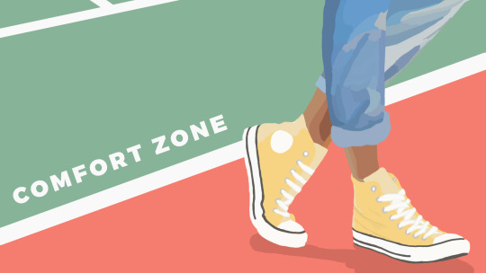
In the illustration below – which is part of my April wallpaper set – I use the color green to convey the safety and familiarity of the comfort zone. The color red, on the other hand, shows risk and danger, but it also represents the courage required to get out of the comfort zone.
So the next time you’re thinking of what colors to use in your project, think of what kind of message you want the audience to receive.
Like the other elements we’ve discussed so far, type conveys meaning beyond what is written. Type can communicate a mood, style, vibe, or feeling. A curly or script font might appear fancy and extravagant, while a handwritten font may seem raw and playful.
Different types of fonts are also suitable for different contexts. For example, sans-serif fonts are more readable on screen while serif fonts are more readable in print. Display fonts, on the other hand, tend to be fancy and decorative, and thus should only be used for small amounts of text, like titles.
Audience and purpose also serve a role in deciding what fonts to use. Large, bubbly text is suitable for a children’s birthday party invitation but probably not for a business card.
In graphic design, different fonts are often used in tandem with each other. The main principle or rule behind this is that you should choose fonts that complement each other. Large, bold fonts should be paired with small, subtle fonts. Oftentimes, you’ll have to rely on your instincts, and that’s okay.
Remember, though, that you wouldn’t want to overwhelm your readers by using too many fonts. Stick to one or two per project. To add variation, change the weight or style of the existing fonts.
Finally, your text would be more effective if you establish some sort of visual hierarchy. This essentially means sorting out your text in order of importance, using different typefaces and fonts. This includes adding a certain weight (or boldness) or increasing the size of texts that are more significant.
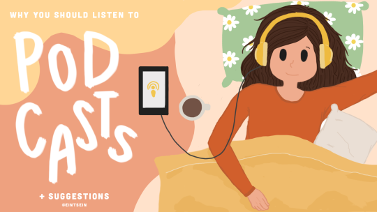
In the title graphic below, the word “podcasts” is handwritten and larger than the rest of the title because that’s what I want to draw attention to, so that readers know what the post is about. My name, on the other hand, is smaller than the other texts.
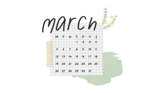
Texture adds tactility and depth and can also be used to evoke a certain feel. In this graphic from my March desktop wallpaper, I used a tape texture and a paint texture to achieve a scrapbook-y vibe.
Some other common textures used in designs are foil, watercolor, and paper textures. Although there are many textures to experiment with and choose from, you should also be careful not to overwhelm your viewers with too many textures in one piece.
Lines, shapes, color, text, and texture are the five basic elements of graphic design, and by understanding how these elements work together, you’ll be able to make more effective designs.
Now, the question is, do I think deeply about all of this when I make my designs? To be honest, not really. A lot of my designs are instinctual, but knowing the theory behind what I’m doing has helped me improve those instincts, and you can do the same!
That’s all for now. Hope this helps, and let me know if you would like me to continue the series or if this brief blog post is enough. Happy designing 🙂
Disclaimer: I’m not a graphic designer, just a stressed-out senior who sometimes likes to design and stuff.