A Pennsylvania museum has solved the mystery of a Renaissance portrait in an investigation that spans hundreds of years, layers of paint and the murdered daughter of an Italian duke.
Among the works featured in the Carnegie Museum’s exhibit Faked, Forgotten, Found is a portrait of Isabella de’Medici, the spirited favorite daughter of Cosimo de’Medici, the first Grand Duke of Florence, whose face hadn’t seen the light of day in almost 200 years.
Isabella Medici’s strong nose, steely stare and high forehead plucked of hair, as was the fashion in 1570, was hidden beneath layers of paint applied by a Victorian artist to render the work more saleable to a 19th century buyer.
The result was a pretty, bland face with rosy cheeks and gently smiling lips that Louise Lippincott, curator of fine arts at the museum, thought was a possible fake.
Before deciding to deaccession the work, Lippincott brought the painting, which was purportedly of Eleanor of Toledo, a famed beauty and the mother of Isabella de’Medici, to the Pittsburgh museum’s conservator Ellen Baxter to confirm her suspicions.
Baxter was immediately intrigued. The woman’s clothing was spot-on, with its high lace collar and richly patterned bodice, but her face was all wrong, ‘like a Victorian cookie tin box lid,’ Baxter told Carnegie Magazine.
After finding the stamp of Francis Needham on the back of the work, Baxter did some research and found that Needham worked in National Portrait Gallery in London in the mid-1800s transferring paintings from wood panels to canvas mounts.
Paintings on canvas usually have large cracks, but the ones on the Eleanor of Toledo portrait were much smaller than would be expected.
Baxter devised a theory that the work had been transferred from a wood panel onto canvas and then repainted so that the woman’s face was more pleasing to the Victorian art-buyer, some 300 years after it had been painted.
Christ men have been Photoshopping women to make us more “pleasing” since for-fucking-ever.
Also, Isabella de’Medici is nice looking, but also has that look in her eye of all Medicis: “I haven’t yet decided whether I’m going to kick your ass, buy you and everything you own, or have sex with you. Perhaps all three.”
It’s interesting the way the repaint has photoshop!Isabella affecting a slightly dreamy, docile gaze into the middle distance; she’s dewy-faced and unthreateningly soft. But in the original, she’s looking you right in the eye. She takes the male gaze and throws it right back at you. That’s a face that says go on, tell me I’d be so pretty if only I had a little repaint, I dare you. I’ll fuck you up.
They also made her hand smaller and I can’t tell if that’s an urn or scepter in her hand but considering it was painted out I wouldn’t be surprised if it was a symbol of power.
Oh, it’s a symbol of power alright. She’s a Medici, daughter of Cosimo I de Medici, First Grand Duke of Tuscany. The Medicis were the most powerful political family in Florence for almost forever. In Florence, the lines between politics, crime, warfare, and the Church were very blurry. They even managed, on four separate occasions, to get one of their own family members elected Pope, usually by very underhanded dealing with the cardinals. They had their fingers in every pie in Italy from 13th through 17th century.
In the case of Isabella, in order to secure an alliance with the Orsini family of Rome, she was married to Paolo Giordano I Orsini when she was 16. Contrary to popular belief, people in Renaissance Europe weren’t all that into child brides, this was just about the politics, so she stayed at her father’s household in Florence until she was of appropriate age. And then she just sort of… never left. Her new husband had zero concept of money, and her dad actually kinda hated him even though he was the one who arranged the marriage in the first place. So Isabella and her 50,000 scudi dowry (at a time when the average Italian earned somewhere between 10 and 40 scudi a year)stayed in Florence. Because she never went to Rome to live with her husband, she enjoyed enormous freedom and power back in Florence. After her mother died, she basically stepped into the role of First Lady of Florence, and was considered one of the keenest political minds in Europe. She ruled what she wanted, bought what she wanted, and fucked who she wanted, with no one really able to tell her no.
She was eventually assassinated by her husband while she was on holiday at one of her family’s country villas, probably because she was fucking her husband’s cousin, Troilo Orsini. Well, she had an “accident” while bathing, and Paolo Orsini said she must have drowned, but the coroner said she was strangled, and several servants swore they saw him do it. He might also have done it on the orders of Isabella’s brother, Francesco Medici, since he was trying to consolidate his power as the next Grand Duke, and by all accounts she was definitely in his way because of her political savvy.
So yeah. She was a boss, and that’s what makes it even more offensive that this Victorian sap tried to make her into this passive, skinny, doe-eyed wimp.
A lot of you have been asking how I go about making my graphics, i.e. how I do graphic design, so I thought I’d make a guide – or perhaps a series of guides if you would like – on how to design graphics! First off, I’d like to introduce you to the fundamental elements of graphic design, and hopefully this will help you gain a new perspective. and improve your own design skills.
Lines are structures that connect two points. They make up everything that we see, even the letters and characters we read every day. But more often than not, we take them for granted. In reality, lines are one of the most rudimentary components of graphic design, and they serve to channel ideas and emotion.
Lines can:
Organize pieces of information or elements on a page
Serve as guidelines to lead the viewer’s eye
Provide movement such as using wavy lines to represent moving water
Emphasize certain parts of the page
Set a mood, such as how straight lines evoke order and neatness while zig-zags convey excitement and tension
A shape is any two-dimensional area with a recognizable boundary. They can add interest to designs (such as in backgrounds), organize visual content, and be used to make illustrations.
Shapes exist in three categories:
Geometric shapes are regular shapes like circles and squares
Organic shapes are more freeform, such as a blob or a leaf
Abstract shapes have a recognizable form but are not exactly natural shapes, such as alphabet glyphs, spirals, and stick figures
When brought together, these shapes can form helpful illustrations that will help convey meaning to your work or add some decoration to it.
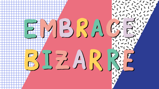
The effects achieved by the shapes are determined by its form, color, size, and other characteristics. For example, triangles often show excitement and risk, while circles are seen as eternal and often feminine.
In the example illustration below, which is one of my January wallpapers, I use triangles to convey a feeling of vivacity and excitement.
Different shapes may also be used to structure content or create a layout, making it easier for the user’s eyes to find information. This is often the case in blogs and websites.
Color can be used to make an image stand out, convey information, enhance meaning, or group things together, but how do you know what colors ‘fit’ together? When you’re starting out, you might find it easier to look for color schemes from pinterest or wherever you can find inspiration. It also helps to look for images or photographs that evoke the same vibe you’re going for, and then using a similar color scheme.
But what if you want to make a palette yourself? Learn color theory!
Before I elaborate, here’s some terminology for you:
Hue is the color itself
Value is how dark or light the color is
Saturation is the intensity of the color
Now, how do you go about making a color scheme? Here are some types of color schemes you should know about:
Monochromatic color schemes only use one hue but vary in value and saturation.
Analogous color schemes use colors adjacent to each other on the color wheel, such as red, orange, and yellow, or blues and greens.
Complementary color schemes use colors opposite each other on the color wheel. To add complexity, play with the value and saturation of these colors.
Split complementary color schemes use colors on either side of the complement.
Triadic color schemes use three colors that form an equilateral triangle on the color wheel. These are often very stark and in-your-face, so you might want to use this type of color scheme in moderation.
Tetradic color schemes use four colors that form a rectangle on the color wheel. These are more effective if one color serves as the main color and the other three colors are just accents.
When choosing a color scheme, the main thing you should keep in mind is balance. Using fewer colors means it’ll be easier to balance and thus it is less likely that the piece will appear messy and discordant.
Color has the power of evoking emotions and moods, and each hue and shade has certain connotations associated with it.
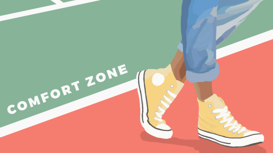
In the illustration below – which is part of my April wallpaper set – I use the color green to convey the safety and familiarity of the comfort zone. The color red, on the other hand, shows risk and danger, but it also represents the courage required to get out of the comfort zone.
So the next time you’re thinking of what colors to use in your project, think of what kind of message you want the audience to receive.
Like the other elements we’ve discussed so far, type conveys meaning beyond what is written. Type can communicate a mood, style, vibe, or feeling. A curly or script font might appear fancy and extravagant, while a handwritten font may seem raw and playful.
Different types of fonts are also suitable for different contexts. For example, sans-serif fonts are more readable on screen while serif fonts are more readable in print. Display fonts, on the other hand, tend to be fancy and decorative, and thus should only be used for small amounts of text, like titles.
Audience and purpose also serve a role in deciding what fonts to use. Large, bubbly text is suitable for a children’s birthday party invitation but probably not for a business card.
In graphic design, different fonts are often used in tandem with each other. The main principle or rule behind this is that you should choose fonts that complement each other. Large, bold fonts should be paired with small, subtle fonts. Oftentimes, you’ll have to rely on your instincts, and that’s okay.
Remember, though, that you wouldn’t want to overwhelm your readers by using too many fonts. Stick to one or two per project. To add variation, change the weight or style of the existing fonts.
Finally, your text would be more effective if you establish some sort of visual hierarchy. This essentially means sorting out your text in order of importance, using different typefaces and fonts. This includes adding a certain weight (or boldness) or increasing the size of texts that are more significant.
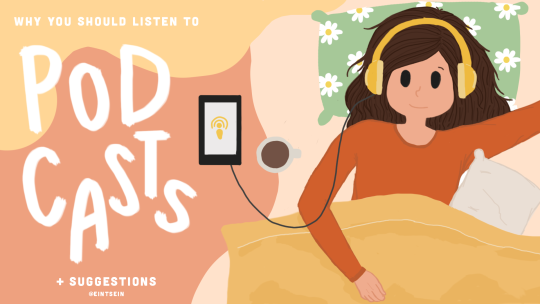
In the title graphic below, the word “podcasts” is handwritten and larger than the rest of the title because that’s what I want to draw attention to, so that readers know what the post is about. My name, on the other hand, is smaller than the other texts.
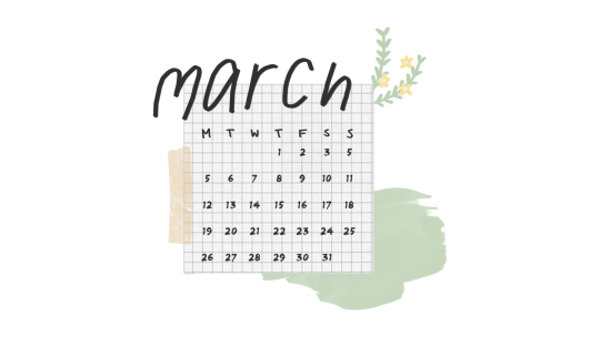
Texture adds tactility and depth and can also be used to evoke a certain feel. In this graphic from my March desktop wallpaper, I used a tape texture and a paint texture to achieve a scrapbook-y vibe.
Some other common textures used in designs are foil, watercolor, and paper textures. Although there are many textures to experiment with and choose from, you should also be careful not to overwhelm your viewers with too many textures in one piece.
Lines, shapes, color, text, and texture are the five basic elements of graphic design, and by understanding how these elements work together, you’ll be able to make more effective designs.
Now, the question is, do I think deeply about all of this when I make my designs? To be honest, not really. A lot of my designs are instinctual, but knowing the theory behind what I’m doing has helped me improve those instincts, and you can do the same!
That’s all for now. Hope this helps, and let me know if you would like me to continue the series or if this brief blog post is enough. Happy designing 🙂
Disclaimer: I’m not a graphic designer, just a stressed-out senior who sometimes likes to design and stuff.
This is an illustration I did for the August 2014 issue of Popular Science Magazine. The assignment was to show a scifi take on human aging in the future. I wanted to do something relatively positive, so I drew a lady whose life has been been prolonged through cybernetic enhancements and augmentation, so she gets to spend time with her great-great-great-great grandchildren.
Thanks to AD Michelle Mruk!
this is beautiful
So I keep wanting to reblog Cyborg Matriarch here, but I keep losing track of her.
tumblr meme culture is really just a form of neo dadaism
I’d like to clarify:
dada was a largely european art movement that took place after wwi. this time and place is not a coincidence. let me explain.
dada art made no sense. the artists who made dada lived in a world in which nothing made sense – in which conventional logic led to the senselessness of a world war. so, making art that made no sense, making – well, you can’t really call it art, so making ANTI-art that rejected the conventions that brought about that atrocity in the first place – it made total sense. (if that makes any sense.)
so the artists did weird things. new things! putting things that were already made together and calling it sculpture, cutting up bits of pictures and putting them together and calling that something to frame – this site has some nice examples.
but from my perspective – there’s serious intellectual continuity between the absurdity of attaching a bunch of tacks to the bottom of an iron, rendering it useless, and say…. bath bomb posts. Put a fucking macbook in a bath. it’s useless now. Nobody fucking cares anymore. you want something funny? you want a punchline? gun. that’s your punchline. Take it. I am laughing
in a way it could be a method of venting some of the frustration and hopelessness and dissatisfaction that tumblr’s userbase (largely, disenfranchised millennials) feels in the modern day. I can’t really speak for anyone else, but… at least from a US perspective, there’s plenty to be disillusioned about. growing up in a constant state of questionably justified war, income inequality, an economic recession caused by the actions of a handful of wealthy fucks who didn’t even get properly punished, growing awareness of police brutality, being called lazy and self-absorbed by the generations that gave us these problems in the first place… I can’t help but think that these factors (and more) could produce a similar mindset to the one that precipitated the first dada movement.
so of COURSE we make nonsense jokes. it’s a coping mechanism for a world which doesn’t make any sense.
related: this isn’t by tumblr but I have to plug UCLA’s atrocity of a virtual gallery once more. it really needs to be experienced, but… it’s definitely also millennial neo dada. from the presentation (like an unplayable video game) to the content (THE DOGS HAVE ARRIVED), it is exactly what I am talking about. it is a fucking shitpost. and it’s high art, too! I love this
tl;dr: my generation is fed up with this bullshit, and the best way that we can express that is by shitposting. alternatively, dada was an early precursor to modern shitposting and we should all thank duchamp for signing a fucking urinal
a dear friend has given a perfect update to some of my phrasing, courtesy of their word replace extension:
you see this? this is exactly what I’m fucking talking about. the thing that I’m talking about is:
I’d also say that while Dadaism was obsessed with the technological aspects of Modernity, of newspapers, of industrial mechanics and factory made clocks, neo-dadaism (of which shitposting but also the increasingly broad reach of the New Aesthetic and net aesthetics) is obsessed with the technological aspects of our time, or at the beginning of our time.
As just a comparison, the Clock in Absurdist and Dadaist art is both a symbol of the uplifting beginning of industrial relations (as one of the first complicated machines made by manufacturers, as the symbol of mankind’s ability to triumph and analyze nature and better ourselves) and as the deified symbol of horrific modernity (of demarcated time, labor hours, the oppression of the working class via managerial time), Neo-Dadaism/Absurdism has a similar relationship with early computers, which both symbolizes the utopian attitudes which we entered the digital age with, and the horrifying period we live in now, where the Digital is ever present and semi-deified.
My favorite dada satire is probably from Georges Grosz who takes the kind of robotic modernist tube people of folks like Leger:
and turns them into these mindlessly patriotic broken automatons chanting rote phrases:
And it’s so so funny to me that there’s all kinds of Gen X artists out there creating art about the millennials on their damn cellumar phones who think they’re the inheritors of this aesthetic but really it’s people who use the Madden gif generator to shitpost because they’re taking the technology meant for a coherent purpose for a particular narrative and they’re breaking it and turning it back on itself.